


1
2
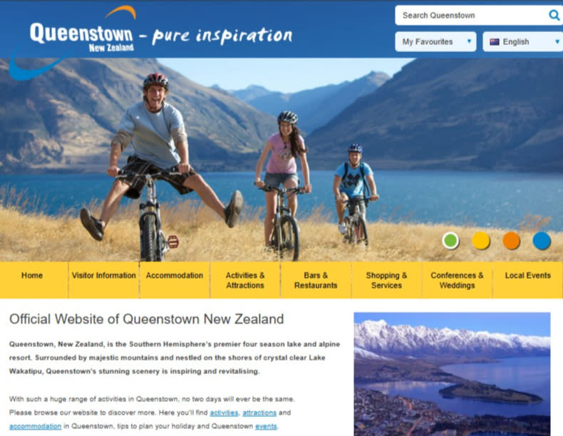
(1) Queenstown NZ 2001 logo, (2) Queenstown NZ website circa 2007
1

2
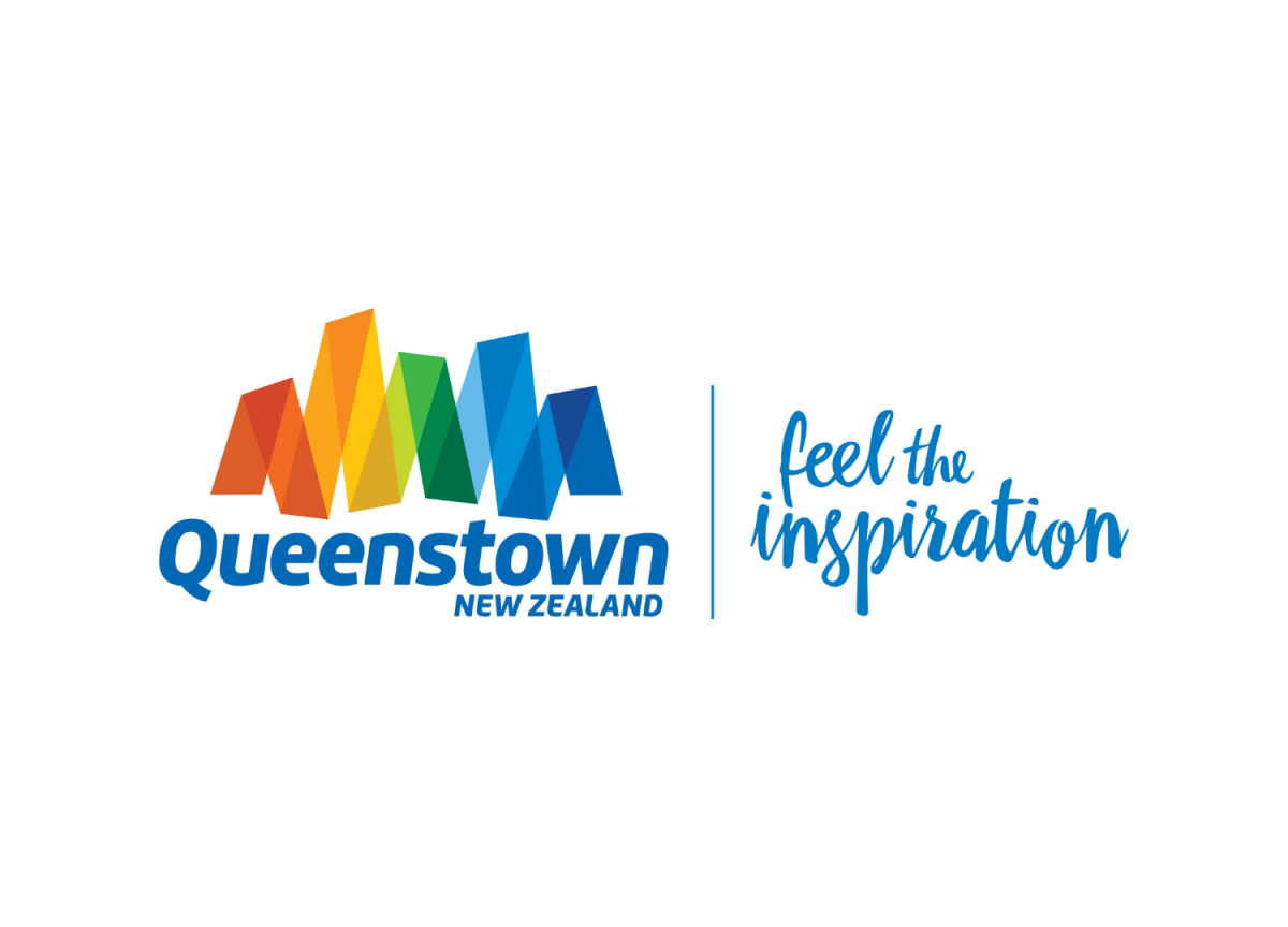
(1) Queenstown NZ 2015 logo, (2) Feel the Inspiration Autumn Ad


Stories
A look at how Destination Queenstown’s visual identity has evolved over the years, reflecting the spirit, energy, and essence of the region.
(1) Queenstown NZ 2001 logo, (2) Queenstown NZ website circa 2007
(1) Queenstown NZ 2015 logo, (2) Feel the Inspiration Autumn Ad